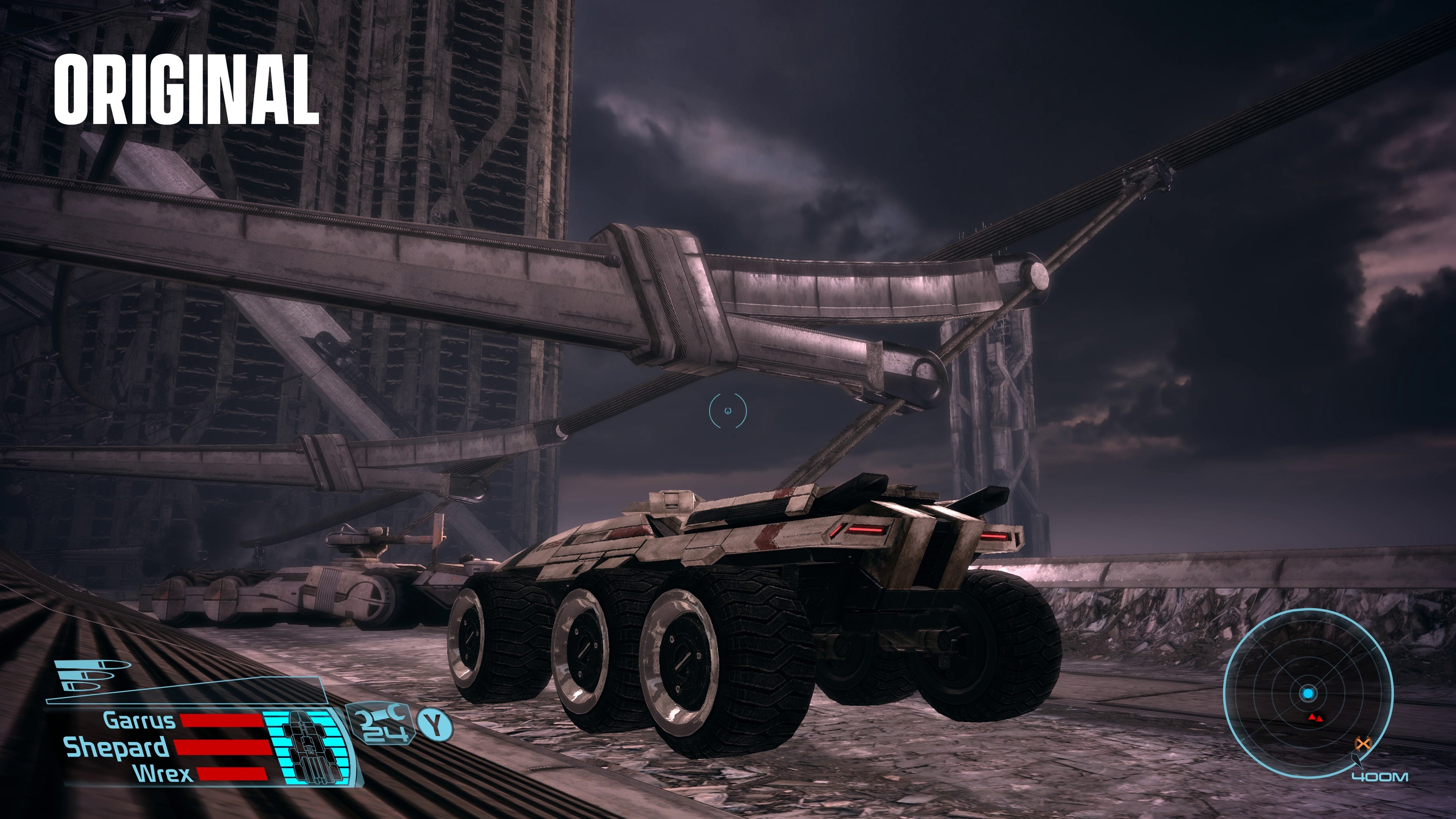
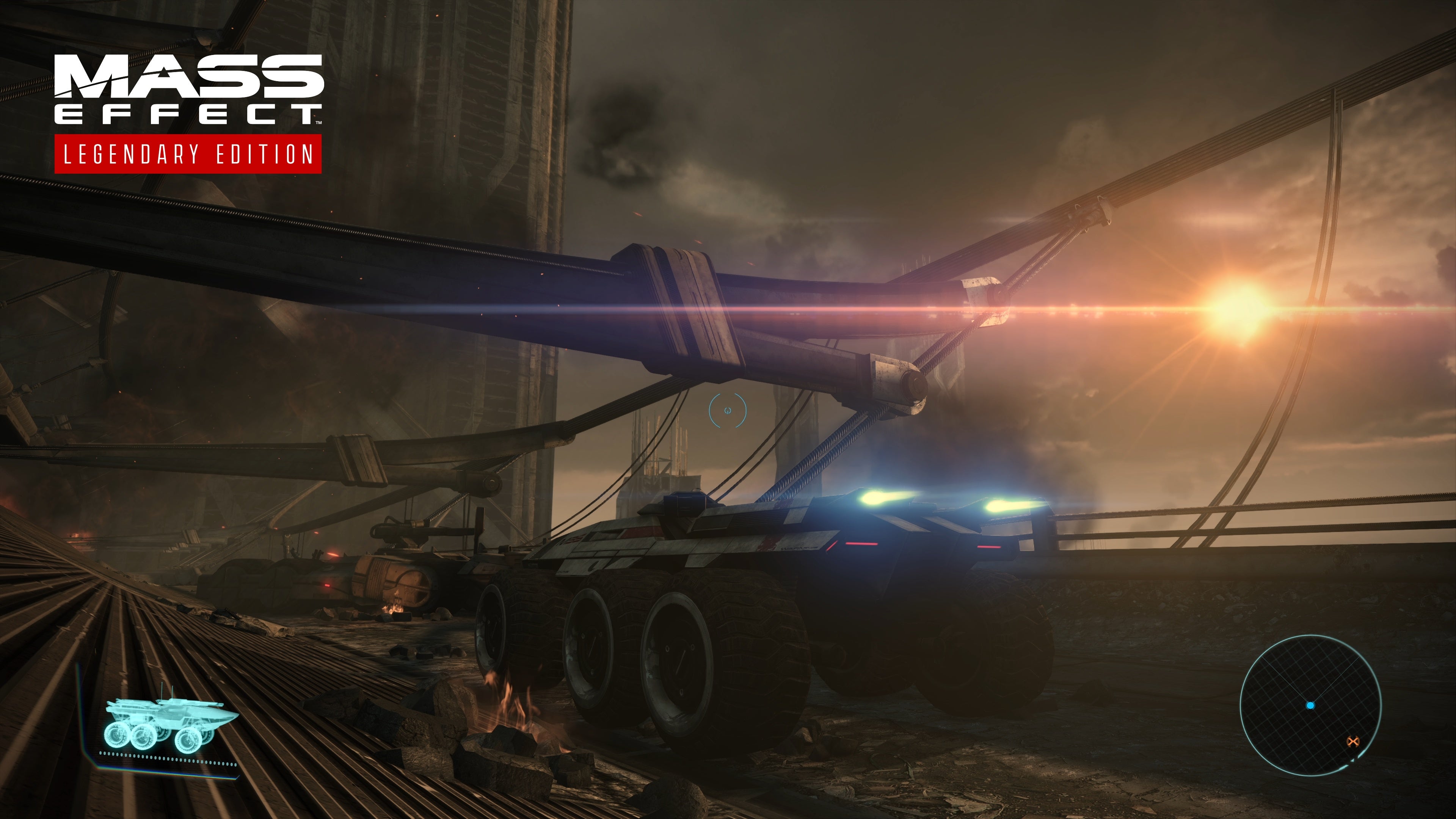
Remasters are a tricky business. It doesn’t matter if you’re Francis Ford Copolla re-cutting The Godfather Part 3 or Nintendo farting out a low-effort Mario 3D Collection, there’s always the same challenge: how much do you change, and how much do you keep the same? Too much of either can be a recipe for disaster. So here we are with the Mass Effect Legendary Edition, a new package that is basically a full 4K remaster of the three Mass Effect games that make up the Shepard Trilogy. These are beloved games and stories, but some of them - in particular the first entry - have aged quite harshly over the years. So how much did BioWare decide to change? We’ve got a full list of gameplay changes and impressions over in our Legendary Edition preview, but BioWare and EA did provide a couple of direct comparison screenshots. We’ll hopefully add to these with more of our once we get our hands on the games - but for now, these will have to do. First up, here’s a screenshot of the main story planet of Feros from the first Mass Effect. This shows how significantly these story areas have been upgraded for the remaster.
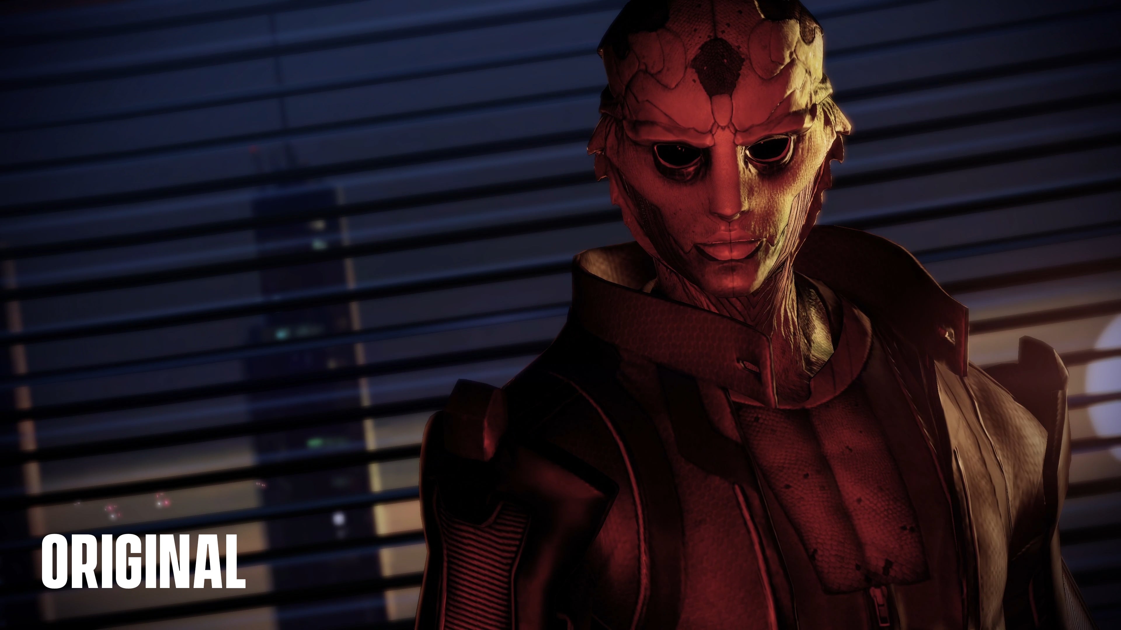
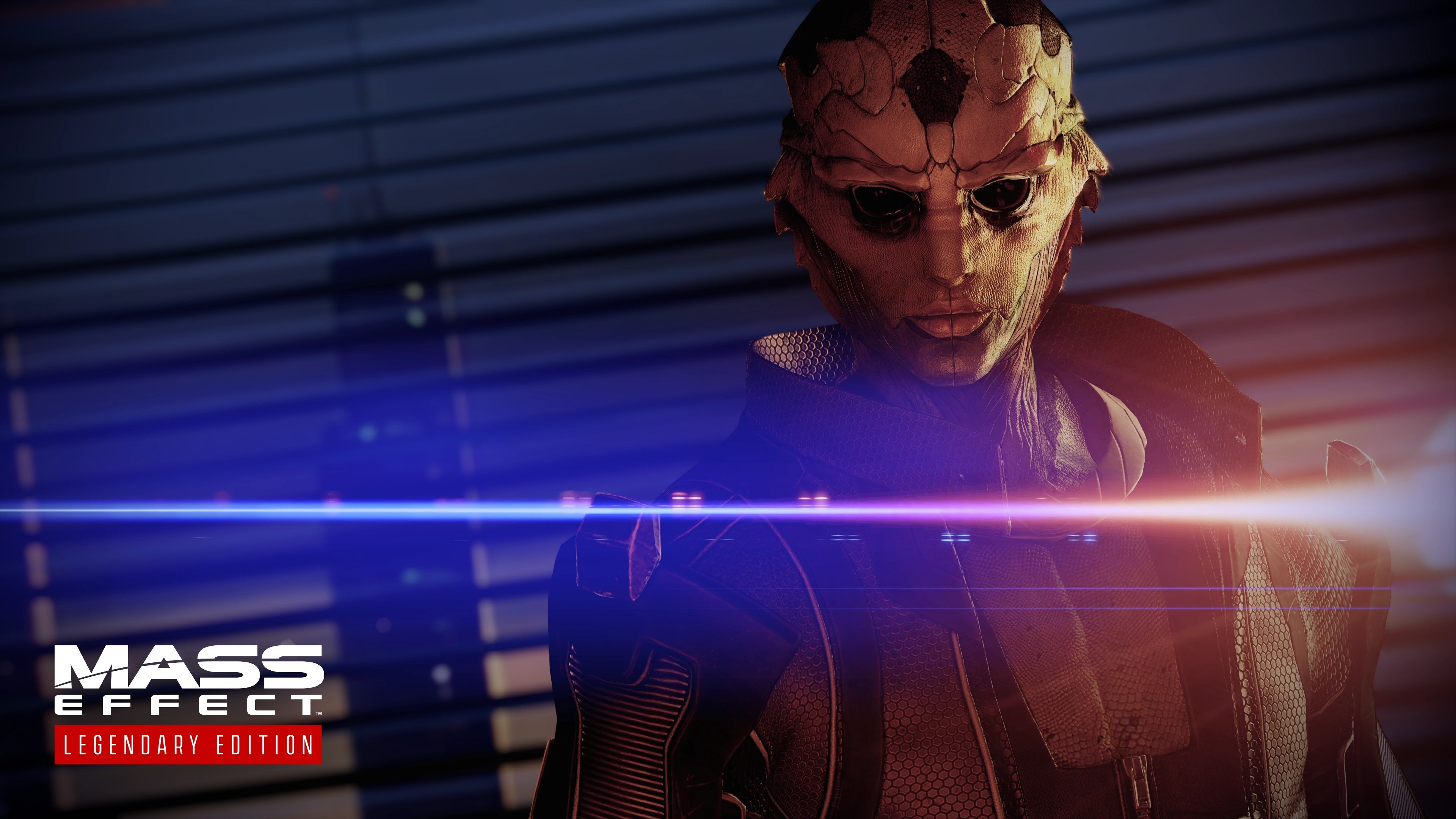
In this screenshot, you can see a few key elements that are worth highlighting. First off, take a look at the heads-up display. As you can see, it’s an upgraded user interface, smaller and less intrusive on 4K displays. You can see the general increase in texture quality, but also take a look at the background of the image: there are more skyscrapers off in the distance beyond the Feros highway the Mako is driving on. There’s also more rubble, smoke and fire effects in general, giving the scene a greater density and driving home the destruction this colony is going through during this mission. Also, you can see the sun has been moved into the player’s path during this section, completely changing the lighting - and arguably the mood. We also know the sun has been moved on Eden Prime to similar effect, though we don’t have a comparison screenshot of that. Next, here’s a screengrab of Thane from the scene where you first meet him in Mass Effect 2, an ideal time to study a character model upgrade close-up.
So, here’s sickly pretty-boy assassin Thane. Try to ignore the absolutely stupid lens flare that now sears across practically every single screenshot EA has released of this game - in truth it is a shiny distraction, just something that gets in the way of seeing the true extent of the changes in Legendary Edition. As you can see, the background has barely changed - but Thane himself has had a significant glow-up. The hexagonal pattern on Thane’s collar and jacket - a pattern common in the clothing of ME2 and 3 - is now much more defined. The edges of Thane’s popped collar look a little more rounded now. Things like the zipper beneath his flash of chest were previously fairly difficult to discern, but now are plainly clear. There’s more wrinkles and natural lines to his face. Also, it’s clear that the lighting of the scene is completely different, far brighter thanks to that mega lens flare. The sun hasn’t actually moved - you can still see it in the original screenshot, in the same spot, and from talking to BioWare it sounds like those sorts of level design changes were reserved for the first game only, but the lighting changes now mean it blazes in powerfully. Which do you prefer? Remember, you can see some more screenshots of Mass Effect Legendary Edition in our general preview. It does seem this remaster is going the distance to try to make the games feel even more joined-up - but some of the changes are no doubt set to promote intense fan debate. Fans will be able to decide for themselves when the trilogy remaster launches for PC, PS4, Xbox One and next-gen systems via backwards compatibility on May 14.


